The problem you are trying to solve: Map out how to make this bracelet and how I (Heather) price the jewelry that I make to sell. To do this I will take pictures of my bracelet in different stages of making it. The bracelet will be photograph on dark green or black velvet cloth for contrast. There will be a fourth picture of scattered beads that were used to make the bracelet. The page layout will be landscape and the pictures will be put in order starting from top to bottom. On the bottom of the page will be a graph showing the number of the five different beads in this bracelet and another graph indicating how much certain amounts of beads are. There will also be instructions about this map at the bottom of the graphs.
Five influences:
1.) Clark, Tom. (17 May 2010). UK public spending by government department, 2008/09. DATABLOG: Facts are sacred. Feb. 22, 2012, <http://www.guardian.co.uk/news/datablog/2010/may/17/uk-public-spending-departments-money-cuts#>.
2.) (2010). RNA-SeqBlog: Transcriptome Sequencing News. Best Practices for RNA-Seg. Feb. 22, 2012, <http://rna-seqblog.com/tag/ encode/>.
3.) (2012). MACH 5 Infographics. DeviantART. Feb. 22, 2012, <http://lobo-gris.deviantart.com/art/MACH-5-Infographics-85431343>.
4.) Tattoo Design Infographic Map-Submit a Infographic Map. Feb. 24, 2012, <http://infographipedia.com/tattoo-design-infographic-map-submit-a-infographic-map.html>.
5.) 30 Superb Examples of Infographic Maps. Feb. 24, 2012, <http://www.webdesignerdepot.com/2009/10/30-superb-examples-of-infographic-maps/>.
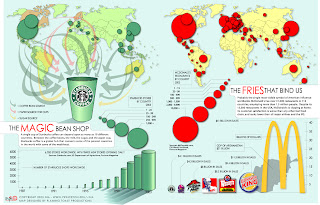
What all five of these maps have that influenced me was that they break down the subject into smaller components to make it easier for the reader to understand what is going on and they use different colors to indicate different fragments of information. The maps dealing with how to get a tattoo and the MACH-5 car is layout similar to what I am planning to do with my bracelet because it uses an actual subject and the tools needed for doing the task. MACH-5 map goes farther by breaking the car up into separate parts with fragments of related information right next to it. The UK public speaking map has a detail typed description about the map on the bottom of the page. The Starbucks and McDonald's map has the same world map but the two world maps are indicating different information with contrast colors and graphs.


Heather,
ReplyDeleteYou should try to find some information graphics that use photographs for influences since you'll be using photographs in yours. This may give you a better vision of how you want yours to look rather then the ones pictured here which are very illustrated.
Your graph can even be an image of a bracelet and you can arrange the beads on it to be most costly to least costly, or do several bracelets that show what stores you purchase the beads from and then arrange the different beads on those bracelets from least costly to most costly or however you see fit.
ReplyDeleteI would try doing a search for "jewelry infographics", this might give you some inspiration for ways to map your subject more effectively.
ReplyDeleteI'm not sure how your piece will look with the pictures you are taking. Another idea would be to have several different bracelets illustrating the different kinds of beads you use and then for the bead that is most expensive have a bracelet that is full of beads and the bead that is least expensive have only a few beads on.
ReplyDeleteI think that you should go with something that is like the first info graphic you have on here. Even though it is not a bracelet it shows the breakdown of the strand, and i think this will work well with the breakdown of each bead you use. Then below this image you can show the other information like the places you buy the beads and which ones you use the most. I would try using graphics of the beads, like you did in your practice mapping project we did a few weeks ago.
DeleteI agree with Amanda, I think that the first graphic that you have in your sources would work best with what you are trying to do. I think your idea is great and the pictures that you take will work well. I am assuming you will include the time it took you to make it and the prices of the different pieces you are using to make the jewelry?
ReplyDeleteI think your first and third influences would fit best for this project. In the first one, the shape of the strand is the same as that of a bracelet. Also, how they break it down will be similar to how you will. The third is a good example of how to write directions with the graphics that's not too boring or overwhelming. However, I also agree with Erin in that you should look at information graphics that use photographs.
ReplyDeleteI really like your idea for this project. It's taking something that's rather small and really looking at all of the components that go into making it, which is awesome to me, cause I like seeing what goes into stuff to make it. Like the others said, look at graphics that use photos, as that should help you out.
ReplyDelete-Jess Lukasavage
The second picture you have in the other post is really interesting, consider going in a scatter plot as I feel it would suit the physical beads as information. That being said, make sure it's not too cluttered, some of the inspiration you cite seems a little overwhelming.
ReplyDeleteErin good's blog has an infographic posted where there is a bowl of fruit on one half of the page and then the fruit laid out as a bar graph on the other half. This enables the viewer to see what goes into making this bowl of fruit in an organized way. You may want to consider doing something like this! Chekc it out!
ReplyDeleteYou have a lot of good data for your work and u believe that a graph would work great for your information but you have to be able to make it a little more interesting use images to help.
ReplyDelete